Posted by Ralph Berrett in Critique on the Big Photo Hunt community board, .
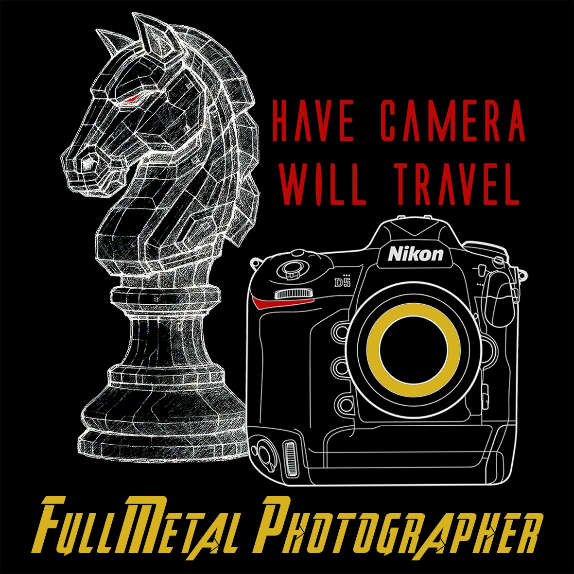
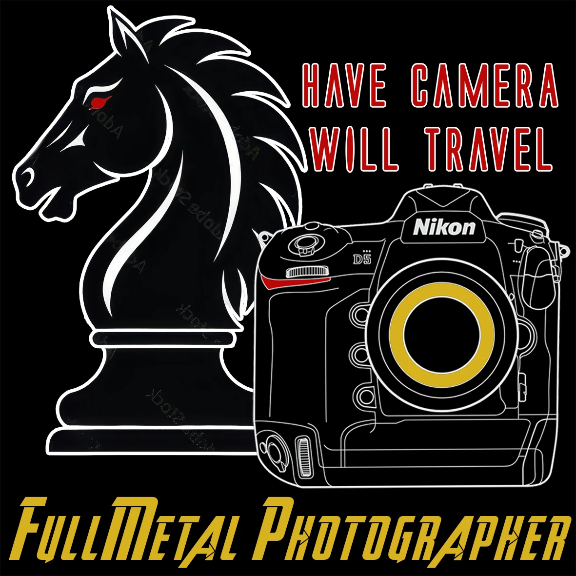
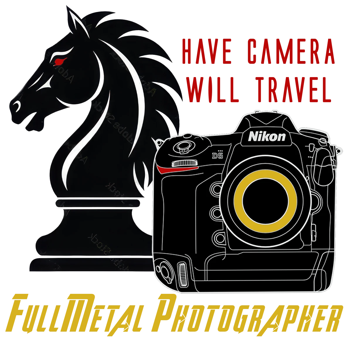
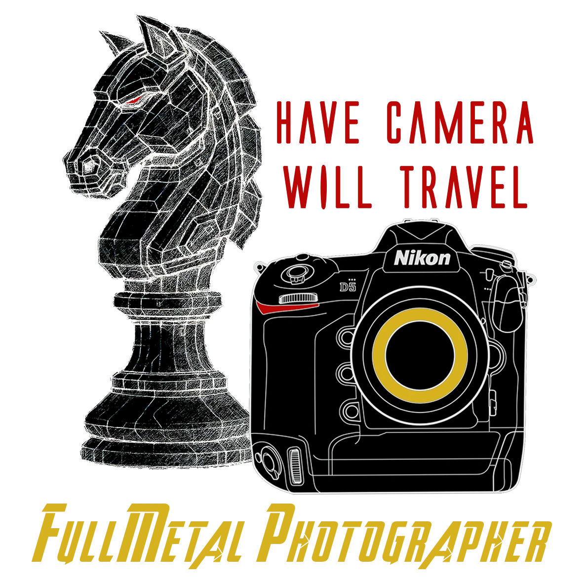
I made changes to the logo. So please let me know which one you prefer.
Replies
Andrew Bailey on
Three has breathing room and is easiest on the eye, I think. I'm not sure about a bit of verbage. I get the impulse, but maybet the "will travel" part is more of an on-site bit. The graphic engages and the point, beneath it, is better served without any other language competing for attention. Just a thought. Best of luck!
Mike Canzoneri on
BTW, your photo of the diving outfielder with the missed baseball and the cap that flew off his head in plain view is stellar.
Mike Canzoneri on
I love chess and I love photography, so I like the idea here. of the four, I prefer the third option.
if you're still up in the air about your logo, here are some things to think about before you finalize your decision. IMHO, a logo should be easily recognizable even when reduced to a size small enough that it appears somewhere on a business card. because of this, the less detail it has, the more easily recognizable it will be. I don't think you need much detail to have impact. think about the most easily recognizable logos we all know: apple, YouTube, mcdonalds, twitter, google, Volkswagen, nike, target, Adidas, Westinghouse, CBS, AT&T, and the list goes on. if you see any of those logos, no matter how small they appear, even without the company name or tagline, you immediately recognize them. all of them are simple designs with no intricate detail. additionally, I would put the company name directly under the logo (which you've done) or immediately to the right of it and have the font large enough that the tagline, in a smaller font, can fit directly underneath it. IMHO, the logo should be able to stand alone and look balanced whether or not the company name and tagline are included with it. just my two cents.
I'm also interested in knowing the origin of the name "Full Metal Photographer" and how the knight chess piece is associated with it. the first thing that came to mind when I saw the name was "full metal jacket".